4 min
AI Proposes, a Person Confirms — The Only Principle That Makes Agentic UX Trustworthy
There is a moment in every agentic product that determines whether users will trust it or abandon it. It is not the accuracy of the AI model. It is not the quality of the interface. It is the moment just before something happens — and whether the user understands what is about to happen and why.
I have been designing AI-powered workflow systems for B2B products for a while now. The single most important lesson is one that sounds almost too simple: AI should propose, a person should confirm. Nothing consequential should execute without explicit human approval. That’s it. Everything else — the visual language, the transparency layer, the confidence indicators — is in service of that one principle.
“The hardest part of agentic UX isn’t making AI work. It’s making people believe it will — and that belief has to be earned through design, not promised through marketing.”
Why automation fails even when the AI is right
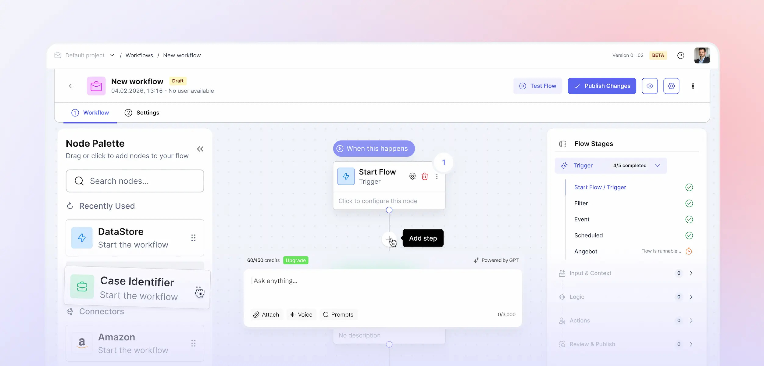
I worked on a workflow automation system for a property management platform used by non-technical staff handling hundreds of routine tenant requests a day. Document requests, key orders, move-out notifications — processes largely predictable in advance, handled manually every time.
The AI could handle 83% of the steps automatically. It could read the request, identify the document type, create a task, assign it to the right team, and draft a reply — all before a human touched the case. But when we first tested a version where the AI simply executed these steps without surfacing them, managers rejected it immediately. Not because it was wrong. Because they couldn’t see what it had done.
They had no way to know if the document type was correctly identified. No way to verify the task went to the right team. No way to review the reply before it reached a tenant. The automation was technically sound and emotionally unusable.
The approval gate is not a limitation — it is the feature
The fix wasn’t simpler automation. It was a different model: AI proposes, person confirms. Every AI-generated output — a drafted reply, a guessed document type, a task assignment — is held for review before anything leaves the system. The manager sees exactly what the AI did, why, and what will happen next. One tap to approve. One tap to override.
When we redesigned around this model, adoption changed immediately. The same managers who had rejected the fully automated version began using it daily. Not because the AI became more accurate — it didn’t change at all. What changed was their relationship to it. They could see what it was doing. They could correct it when it was wrong. They felt in control.
“Users don’t resist automation because it’s too complex to configure. They resist it because they can’t see what it will do.”
One colour for AI, everywhere
The second design decision that made this work was consistency of signal. Every AI-powered step or output in the system carries the same visual marker — one consistent badge, one colour, applied everywhere: in the workflow builder, in the live case view, in the activation summary, in the notification. One signal, learned once, recognised anywhere.
This matters because cognitive load in B2B tools is already high. Property managers are juggling dozens of cases simultaneously. The last thing they need is to decode whether a given output was generated by a fixed rule, by AI, or by a colleague. One colour for AI. Always. No exceptions.
When AI isn’t sure — it should say so
The hardest interaction to design was not the confident case — it was the ambiguous one. A tenant sending a message like “Hi, could you send me the document for my apartment? I need it for my bank.” No clear document type. Multiple possible responses.
The naive approach is to let the AI guess and execute. The correct approach is to show the AI’s confidence explicitly — “Utility statement · 78% match” — alongside alternatives, and require a human to confirm before anything runs. When AI isn’t sure, it asks. It doesn’t guess silently and hope for the best.
This interaction — AI uncertainty surfaced honestly rather than hidden — is where long-term trust is built. Users who see the AI acknowledge its own limits are far more likely to trust it when it is confident. The admission of uncertainty is not a weakness in the product. It is the most trustworthy thing an AI system can do.
What this means for how we design
Agentic UX is not a category of features. It is a different model of human-computer interaction — one where the system acts on behalf of the user rather than waiting for instruction. That shift changes what design is responsible for. We are no longer only designing screens. We are designing the moment of delegation: when a user hands a task to an AI system, and what they need to feel safe doing so.
The principle is simple. The execution is not. Getting it right requires designing the transparency layer with the same care as the primary interface — the activation summaries, the confidence signals, the audit trails, the override paths. These are not secondary concerns. They are the product.
AI proposes. A person confirms. Start there, and everything else becomes clearer.
