Limitless
Behaviour-Driven Fitness Experience
Behaviour-design for a fitness app — reducing time-to-workout and lifting third-week retention.
Client
Limitless
Competitors
Whoop · Freeletics · Peloton
My Role
Product Designer – UX research, UI, design system
Industry
HealthTech · Fitness · Mobile app
Deliverables
Mobile product, design system, prototyping, behaviour-design patterns
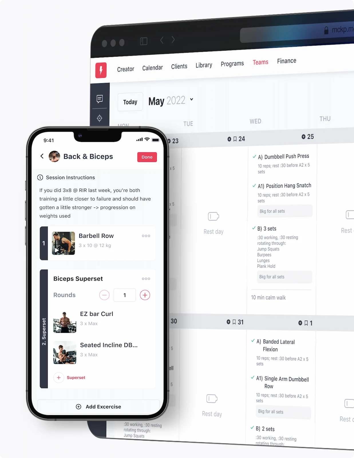
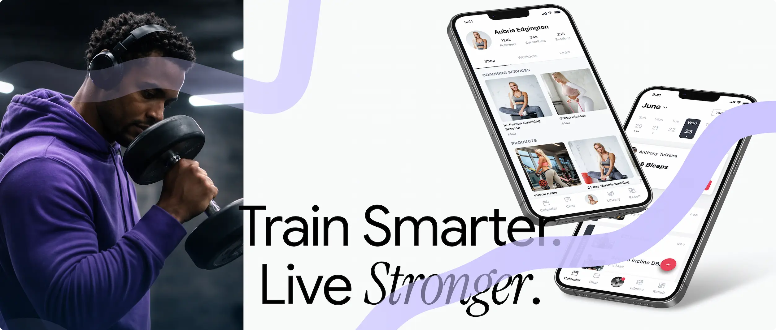
Limitless is a mobile app for people who want to train regularly, track results, and see real progress. It lets users build personal workouts, follow popular trainers, work with online coaches, and track muscle-group progress over time.
The audience – active 18- to 32-year-olds – is dense with fitness apps. The brief wasn’t to add features; it was to define the behaviour patterns that would keep users training in week three, when most fitness apps lose their audience.
Keywords:
– Mobile UX
– Behaviour design
– Design system
– Engagement patterns
– Health & fitness
– Prototyping
The challenge
Most fitness apps are abandoned within two weeks. The product needed to feel motivating without being shouty, customisable without being dense, and structured around the user’s progress rather than the app’s features. The system had to make the right action – opening the app and starting a session – the easiest action.
My Role
I led UX from research through delivery – interviews, scenarios, flows, the design system, and the dev hand-off – focused on the behavioural mechanics that decide whether a fitness app survives week three.
– Ran user interviews and analysed competing fitness apps to understand what actually keeps people training past the first weeks.
– Built empathy maps and user journeys around the emotional touchpoints that drive habit formation.
– Designed the core flows for creating, editing, and tracking workouts to be near-frictionless, including a 45% reduction in time to create a personal session.
– Designed the Discover section as a curated programme library so users could move from intent to first session in seconds.
– Built a unified design system with high-contrast neon-on-dark visual language tuned for energy and readability.
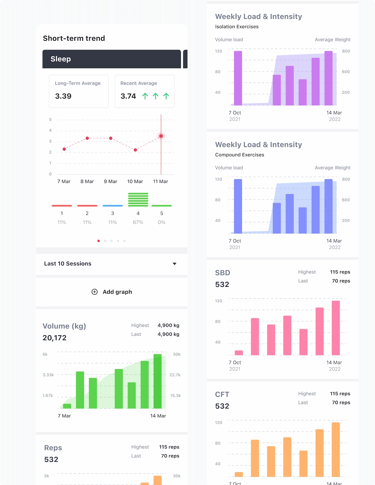
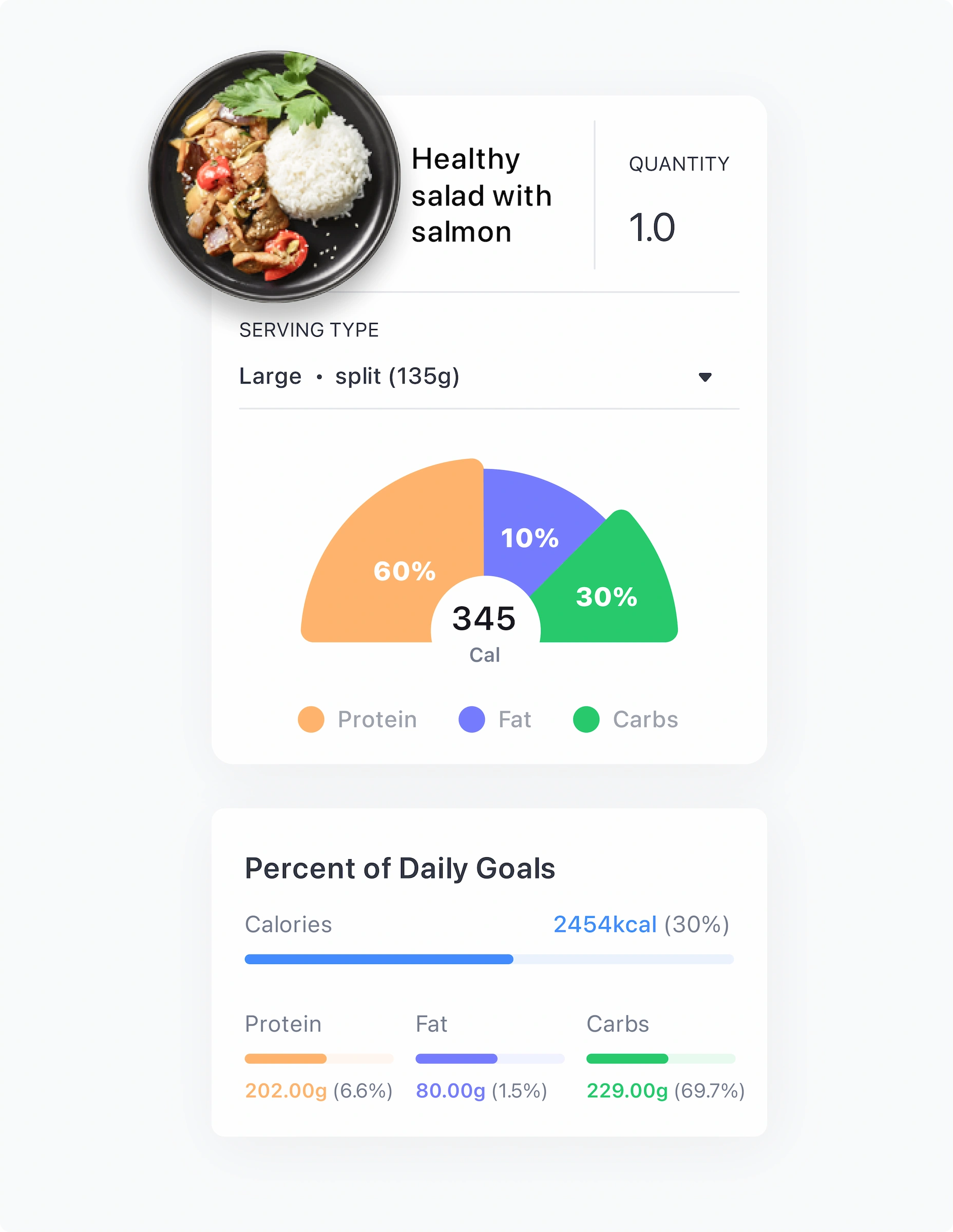
– Designed the personal-progress tracker as the emotional anchor of the product – visual feedback over numbers.
Impact
“A fitness app doesn’t fail at functionality – it fails at week three. The interface’s job is to be the path of least resistance on the day you don’t feel like training.”
Key Screens
Main + Discover
- Workout management and recent activity
- One-tap session start
- Curated programmes from trainers and bloggers
- Subscription path inside the same flow
Goal: Reduce time-to-workout to seconds.
Progress + Profile
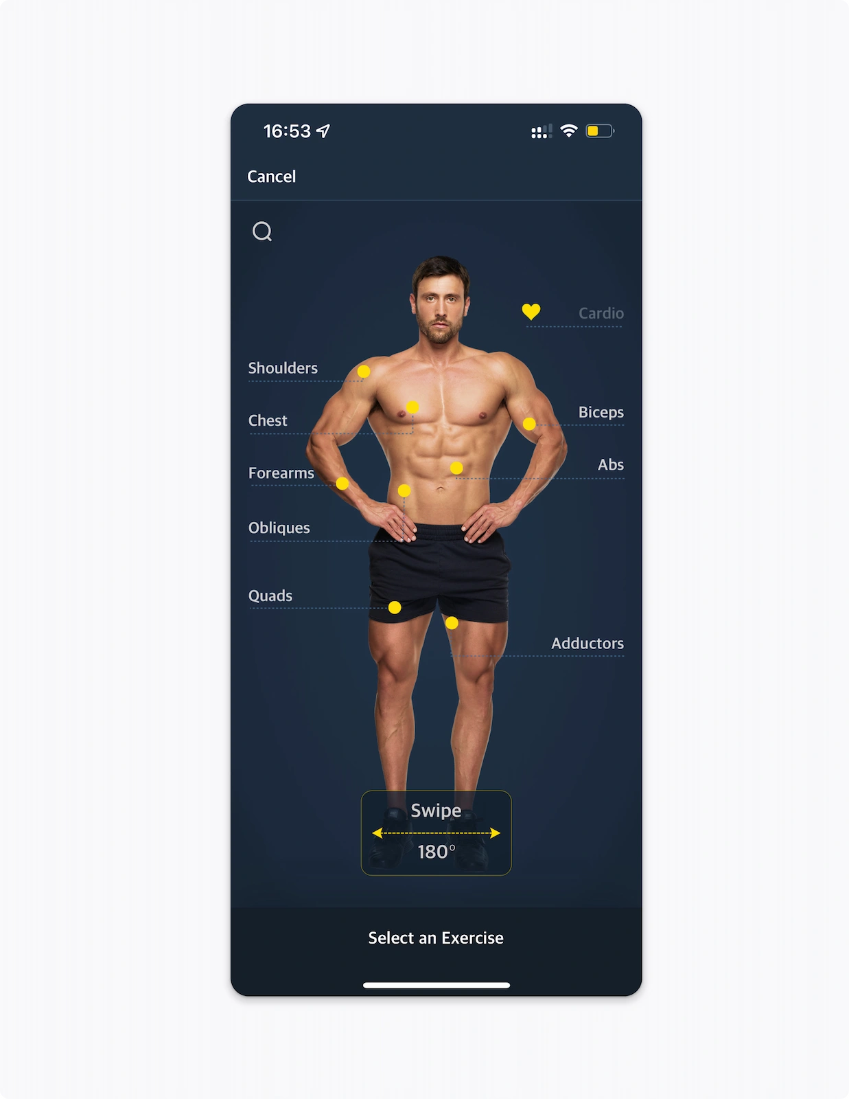
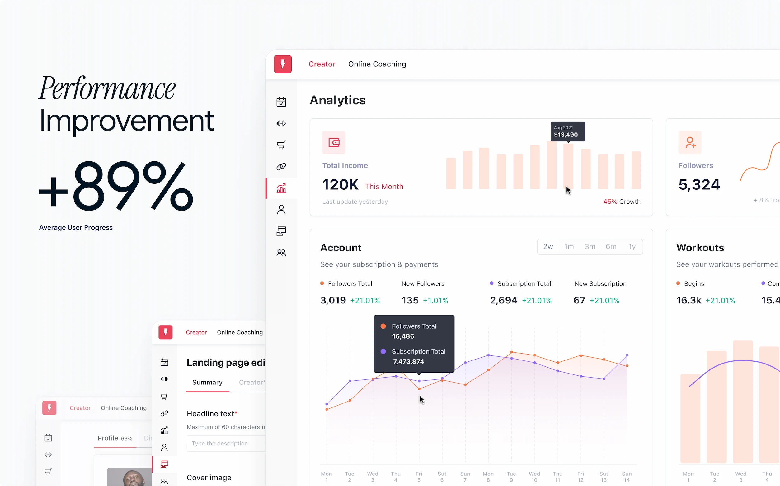
- Visual reports by day, week, and muscle group
- Personal-achievement tracker with streaks
- Device sync (wearables)
- Online-trainer selection and chat
Goal: Make progress visible and motivating, not statistical.
Process
Research
I focused the research phase on motivation, not features: why people quit after the first weeks, what actually preserves motivation, what visual signals build trust. The output was an empathy map and user journey that surfaced the real emotional touchpoints and barriers.
UX design
Designed simple flows for creating and editing workouts, a flexible tracking system by goals and muscle groups, and a Discover section curated by trainer and blogger. Personal-achievement tracking with visual feedback was the emotional spine.
Design system & UI
A visual language tuned to inspire without overwhelming – deep dark backgrounds, neon accents for dynamism, modern contrasting typography, and a clear component set: exercise cards, progress bars, category chips, CTAs with explicit icons.
Mobile app design
Four core screens – Main (workouts and stats), Discover (curated programmes), Progress (visual reports), Profile (sync and trainers) – all unified through the same design system that powers the marketing surface.
Outcome & Reflection
Limitless became the kind of fitness app that supports its user every day – not by talking more, but by showing up faster. Engagement rose 38%, time to create a workout fell 45%, and third-week retention climbed 26%.
What this project taught me: visual language and content structure shape habit and discipline. UX can genuinely help people show up for themselves – when the interface gets out of the way.