RevelForms
Interactive Video Forms for Lead Capture
B2B SaaS for video-first lead capture — cutting form-fill time by 3× and bounce by 4×.
Client
My Role
Lead Product Designer – UX, design system, team lead
Industry
B2B SaaS · MarTech · Video software
Deliverables
Product UX, design system, conversion-focused flows
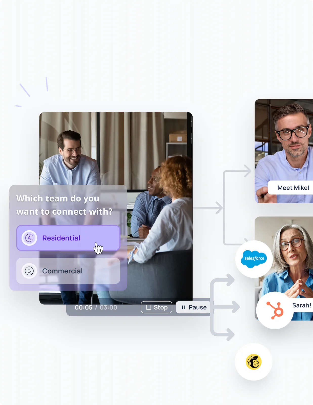
RevelForms is a B2B SaaS platform that helps marketing and sales teams collect leads through interactive video forms – record a personalised greeting, set a flow, embed it in the sales funnel. The platform had the right idea, the wrong UX. Marketers and small-business owners were getting lost in step navigation, forms took 4:30 minutes to complete on average, and the bounce rate hit 40% on the first screen. The brief was to cut both the time and the friction without removing the product’s flexibility.
Keywords:
– B2B SaaS
– MarTech
– Conversion UX
– Design system
– Workflow design
– Self-serve product
The challenge
A product made for non-technical users that, in practice, demanded technical patience. Five-step flows, dense settings panels, and unclear CTAs were creating drop-off at the worst possible moment – between the marketer’s intent and the lead’s first interaction. The fix had to keep the product flexible.
My Role
I led product design end-to-end – research, IA, the design system, and the team – partnering with product and engineering to translate marketing logic into a self-serve product architecture.
– Audited competitor experiences (Typeform, VideoAsk, Loom) and ran 17 interviews with marketers and business owners to identify the real points of drop-off.
– Cut form creation from 5 steps to 3 through interaction-model redesign, not feature removal. Designed a component-driven design system that scaled across the editor, the published form, and admin views.
– Established CTA, visual hierarchy, and call-to-action optimisation as first-class system patterns rather than per-screen decisions.
– Designed the path from video view to form submission to be readable in a single glance.
– Led the design hand-off through Figma Dev Mode with full documentation, so the team could ship without per-screen review cycles.
Impact
“B2B SaaS UX research isn’t about making things prettier — it’s about finding the exact step where intent leaks. Fix that and the metrics move on their own.”
Key Screens
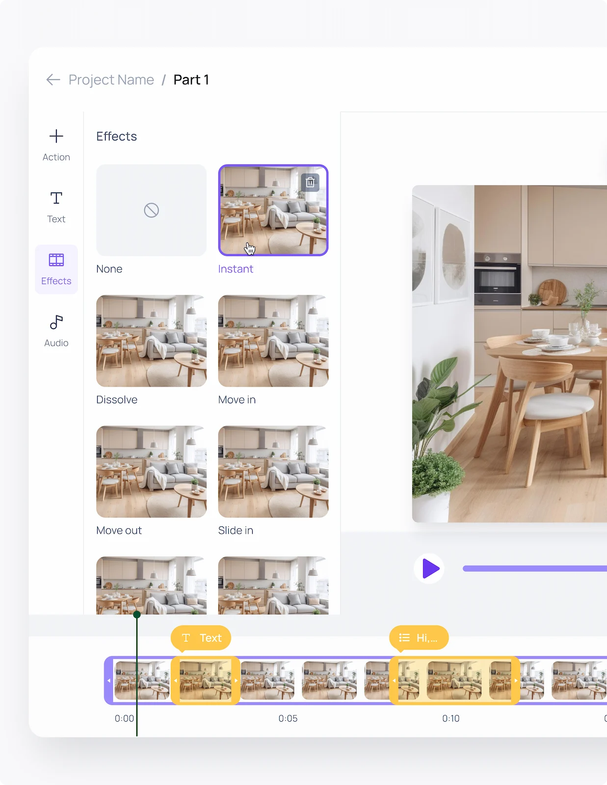
Editor
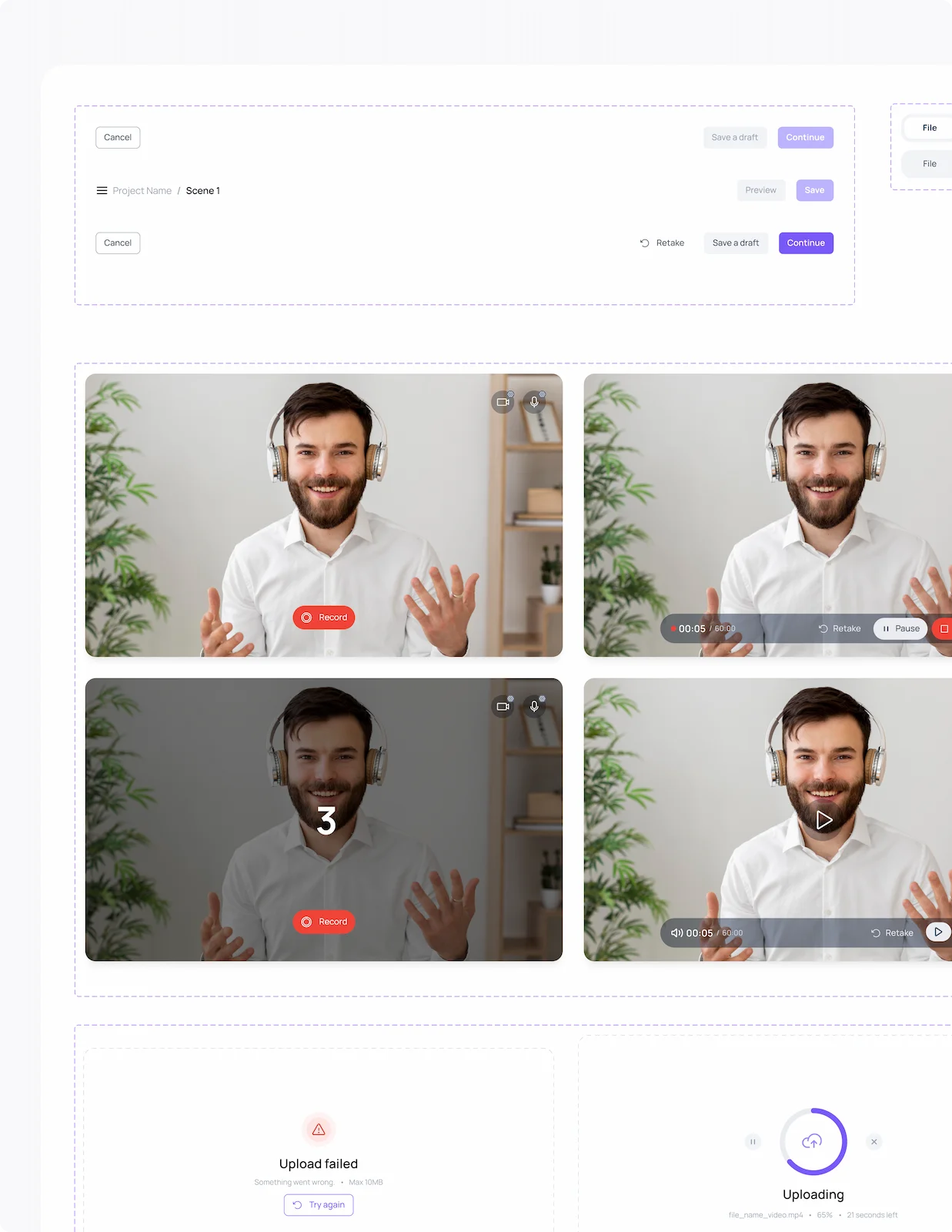
- 3-step flow: Record → Configure → Publish
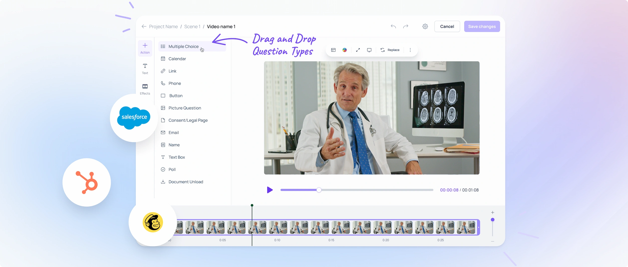
- Component-driven design system with live preview
- Library of reusable scenario templates
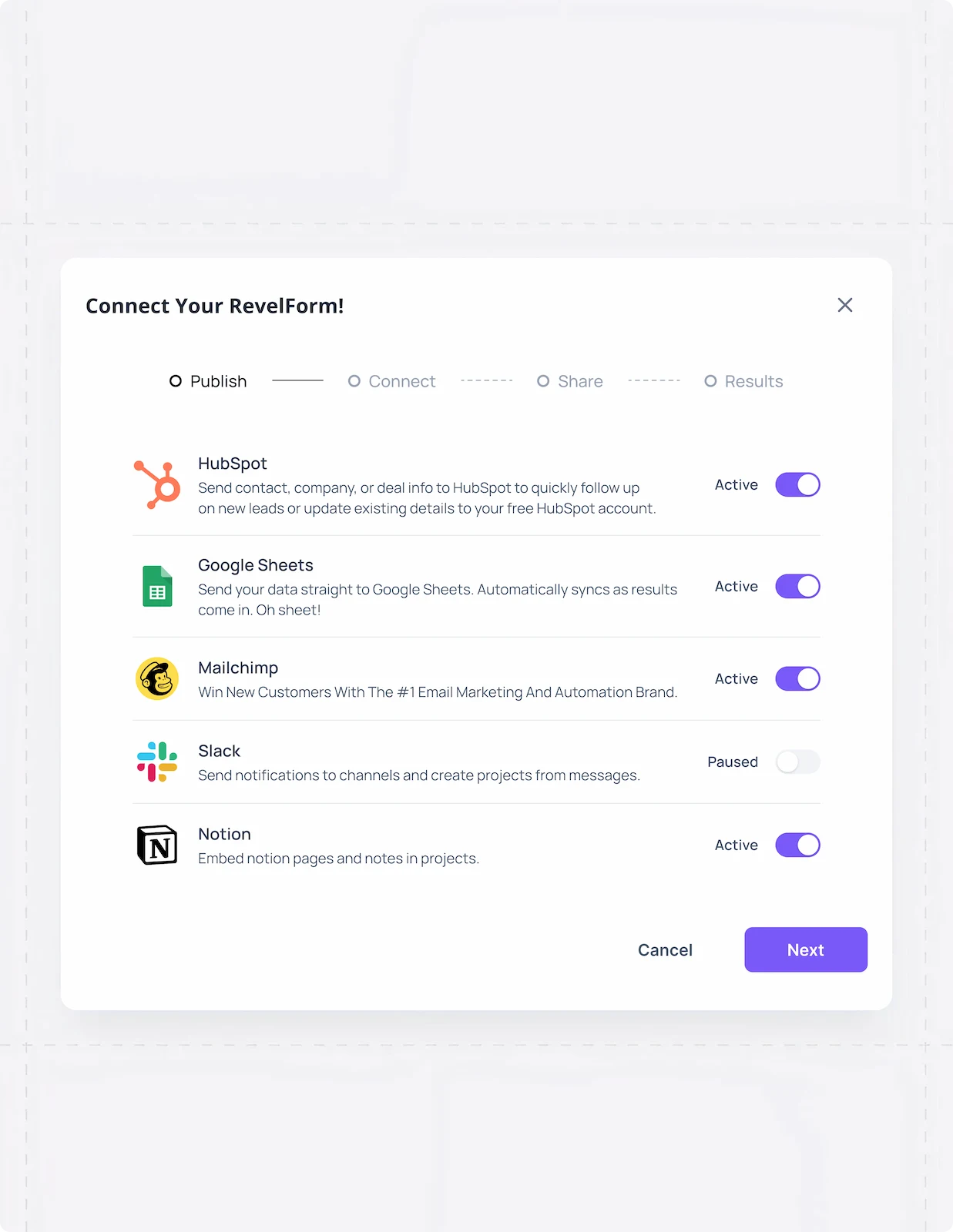
- One-click embed and integration
Goal: Make a B2B configuration tool feel like a consumer app.
Published form
- Light, neutral palette focused on the video
- Single, unambiguous CTA per screen
- Reduced field set with progressive disclosure
- Mobile-first responsive layout
Goal: Cut the path from view to submit to a single decision.
Process
Research
UX audit of Typeform, VideoAsk, and Loom; 17 interviews with marketers and small-business owners. The pattern was clear: users could record video easily but stalled at flow configuration. Wireframing & flow design.
Wireframes built around minimalism
Defined the key CTAs and user flows. Simplified the path from watching a video to submitting a form, mapped end-to-end.
Design system
Built a component-based design system with a light, neutral palette focused on content. Prototyped the interactive scenarios and handed off via Figma Dev Mode with full documentation.
Testing & iteration
Tested against real marketer scenarios; iterated on field count, CTA hierarchy, and the first-screen experience until bounce rate fell from 40% to 10%.
Outcome & Reflection
The combination of UX research and a component design system didn’t just clean the interface – it moved the business numbers. Conversion rose 28%, average form-fill time fell from 4:30 to 1:30, and the platform now scales to new niches (e-commerce, SaaS, education) on the same foundations.
What I take from this case: in B2B SaaS, the product’s job is to make the user’s intent the path of least resistance. Everything else is interface debt.